
Discover how to effectively create scorecards with dynamic sparkline graphs in Looker Studio. Scorecards provide a quick overview of key metrics, while sparkline graphs add a valuable historical context to your data.
In this tutorial, I’ll guide you through the process of creating engaging scorecards with embedded sparkline graphs, enhancing your data visualisation capabilities.
Header Outline:
- I. Introduction
- II. Understanding Scorecards with Sparkline Graphs
- III. Preparing Your Data Source
- IV. Building a Scorecard in Looker Studio
- V. Adding Sparkline Graphs To The Scorecard
- VI. Adjusting The Look Of Your Sparkline Graphs in Scorecards
- VII. Customization and Formatting
- VIII. Interactivity and User Experience
- IX. Considerations and Best Practices
- X. Conclusion
I. Introduction
In this guide, we’ll explore how to take your data reporting to the next level by creating scorecards with embedded sparkline graphs. This combination allows you to present key metrics alongside their historical trends in a visually engaging manner.
II. Understanding Scorecards with Sparkline Graphs
Scorecards are a compact way to display key performance indicators (KPIs), while sparkline graphs visualise the trend or pattern of a metric over time. Together, they provide a comprehensive snapshot of data and its historical context.
III. Preparing Your Data Source
A. Accessing Data in Looker Studio
Log in to your Looker Studio account. Create a new report or open an existing one.
B. Structuring Time-Series Data
Ensure your data source includes a time dimension (e.g., date or timestamp). Organise your data so that it contains relevant metrics tied to specific time points.
IV. Building a Scorecard in Looker Data Studio
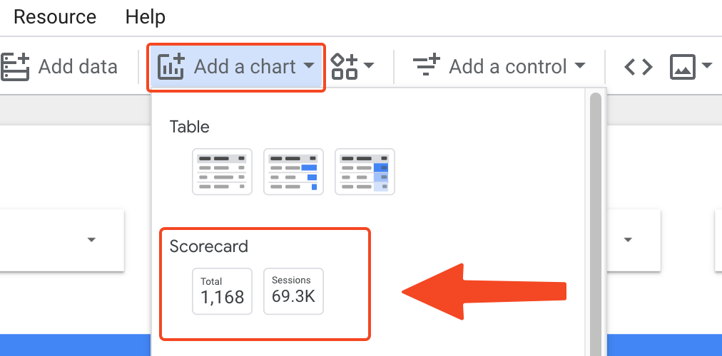
A. Adding Scorecard Components
In your report, navigate to the page where you want to create the scorecard. Click the “Add a chart” button. Choose “Scorecard” as your chart type.
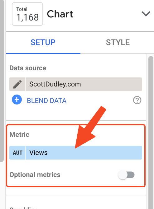
B. Configuring Metrics and Values
Select the metrics you want to display in the scorecard. Customise the formatting and appearance of the scorecard to suit your preferences.
V. Adding Sparkline Graphs To The Scorecard
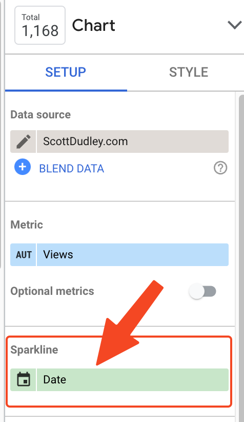
A. Preparing Data for Sparklines
Create a new data source for the sparkline graphs or use an existing one. Ensure this data source includes the same time dimension used in the scorecard.
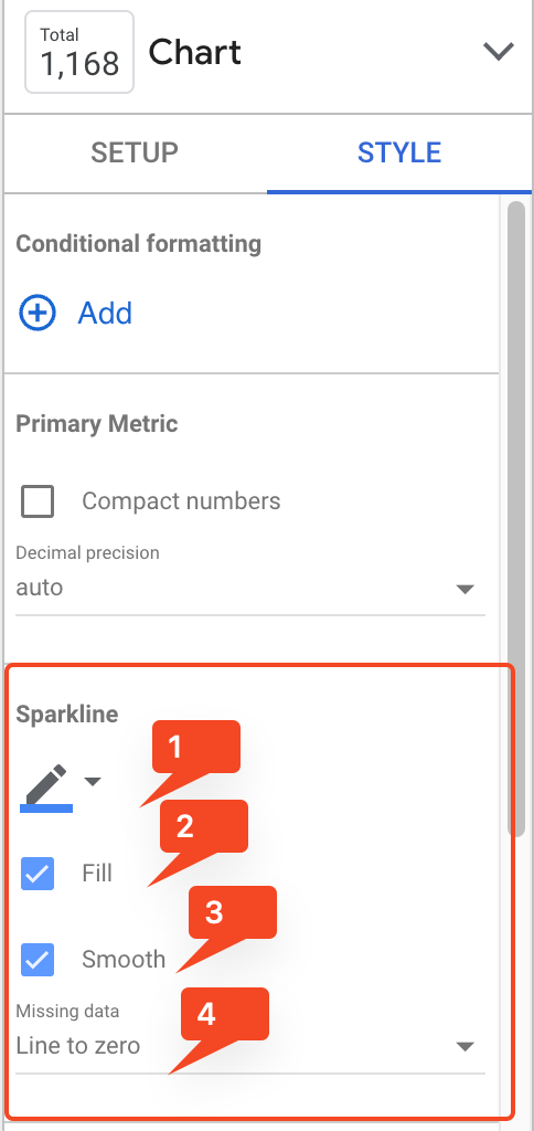
B. Configuring the Sparkline Graphs
Add a chart to your report. Choose a chart type suitable for sparklines (e.g., “Time Series Chart” or “Line Chart”). Configure the chart to display the metric’s historical trend over time.
- Choose the colour for your sparkline.
- Choose whether you want to fill your sparkline, or just show the outline. I recommend to fill, it looks much better.
- Choose whether you want smooth lines or not.
- Choose what you want to happen for null or 0 values. I always choose “Line To Zero” here.
VI. Adjusting The Look Of Your Sparkline Graphs in Scorecards
You can experiment with size and colour options to make the scorecards look as appealing as possible. Bigger scorecards stand out more and are easier to read, and the sparkline underneath stands out more too.
VII. Customisation and Formatting
Customise the appearance of the sparkline graphs and scorecard components to maintain a consistent visual style. Use colour-coding and labels to highlight trends and metric values effectively.
Here is an example of what you can do by copying and pasting the same scorecard and changing the metrics:
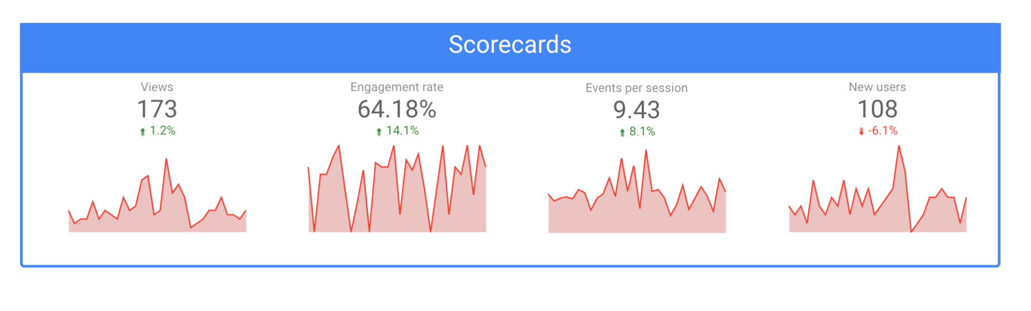
In this example, I have put a nice blue border around the 4 scorecards and included a header above to describe what they are. Obviously, it would be better to use something more descriptive than just “Scorecards”.
VIII. Interactivity and User Experience
Enhance interactivity by adding date range controls and filters, allowing users to explore data trends with ease. Ensure a user-friendly experience by adding tooltips and explanatory text.
IX. Considerations and Best Practices
Regularly update your data source to ensure the scorecards and sparkline graphs reflect the latest data. Test the report on various devices to ensure it’s responsive and visually appealing.
X. Conclusion
Creating scorecards with embedded sparkline graphs in Looker Studio transforms data reporting into a more insightful and engaging experience. You can effectively showcase key metrics and their historical trends, providing a comprehensive view of your data to inform decision-making and drive actionable insights.