Discover how to effectively visualise metric locations using geo maps in Looker Studio. Geo maps provide a dynamic and insightful way to understand spatial data and its impact. In this tutorial, we’ll guide you through the process of creating engaging geo-maps that bring your metrics to life on the map.
Learn step-by-step how to integrate your data, customise map layers, and unlock geographic insights that drive better decision-making.
Header Outline:
- I. Introduction
- II. Leveraging Geo Maps in Data Visualization
- III. Building a Geo Map in Google Data Studio
- IV. Enhancing Insights with Interactive Elements
- V. Considerations and Best Practices
- VII. Conclusion
I. Introduction
Geo maps provide a compelling way to visualise data based on geographic locations. In this guide, we’ll demonstrate how to create a dynamic geo map in Looker Studio, enabling you to showcase the distribution of metrics across different locations with bubbles, so you can gain deeper insights from your data.
II. Leveraging Geo Maps in Data Visualisation
Geo maps offer an intuitive way to convey insights by overlaying metrics onto geographical regions. Whether you’re analysing sales, customer distribution, or any location-based metric, a geo map provides a clear visual representation of data patterns.
III. Building a Geo Map in Google Data Studio
A. Adding a Geo Map Component
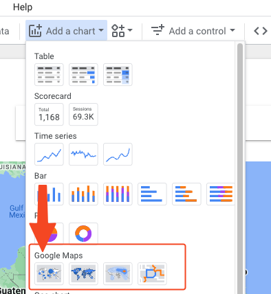
In your Looker Studio report, navigate to the page where you want to add the geo map. Go to “Add a chart”, and then under Google Maps, choose the first option (Bubble Map).
B. Configuring the Geographic Dimension
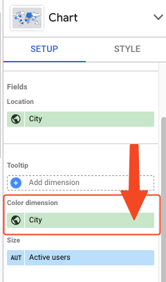
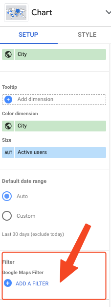
In the “Data” tab on the right panel, choose the geographic dimension you want to visualise (e.g., “Country”).
C. Mapping Metrics to Geographic Locations
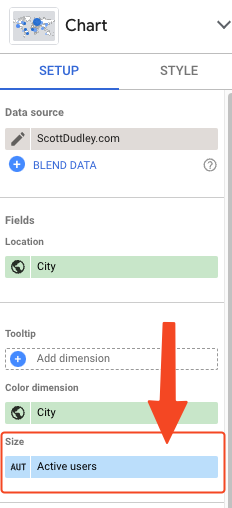
Drag and drop the metric you want to display onto the geo map. Looker Studio automatically associates metric values with their corresponding geographic locations.
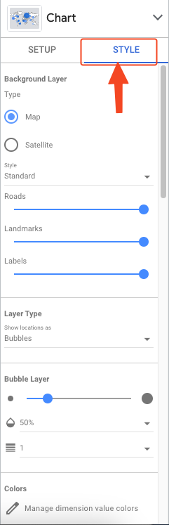
D. Customising the Geo Map
Customise the appearance of the geo map by adjusting colors, legends, and data labels. Experiment with different map styles and markers to enhance visualisation.
IV. Enhancing Insights with Interactive Elements
Add filters to the geo map to allow users to focus on specific geographic regions or metrics. Incorporate tooltips to provide additional context when users hover over map markers.
V. Considerations and Best Practices
- Choose the appropriate geographic dimension based on your data and analysis goals.
- Ensure consistent data formatting across your geographic dimension to avoid discrepancies.
- Use contrasting colours and clear labels to improve map readability.
VI. Conclusion
Creating a geo map in Looker Studio enables you to transform location-based data into actionable insights. By following the steps in this guide, you can effectively visualise the distribution of metrics across geographic regions, making data-driven decision-making more accessible and intuitive.
Elevate your reports with dynamic geo maps and gain a new perspective on your location-based metrics.